Tavo
Industry ®
Premium Tea & Mindful Living
Scope of work
Logo & Branding, Packaging Design
Location
India
Logo & Branding
Bringing the Concept to Life:
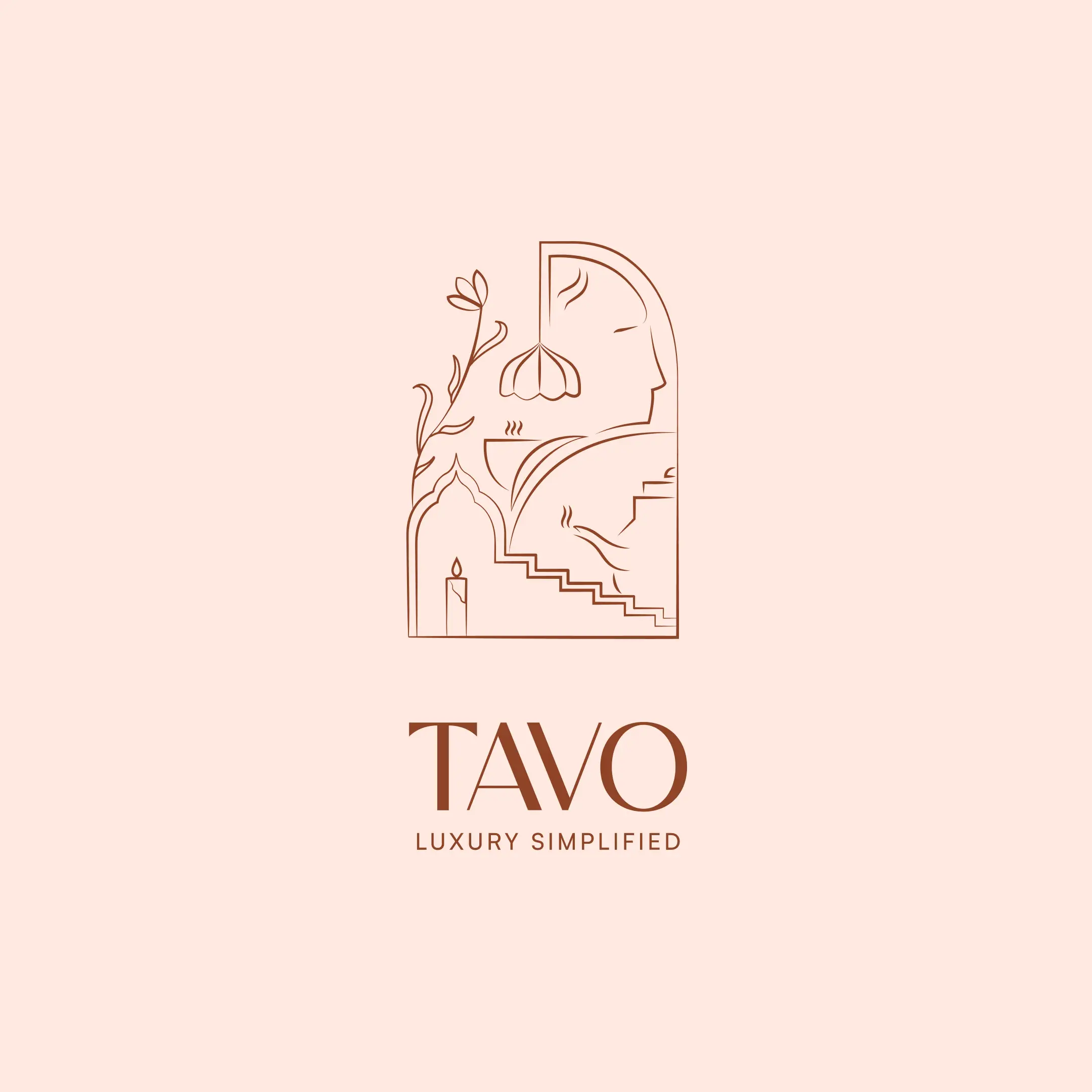
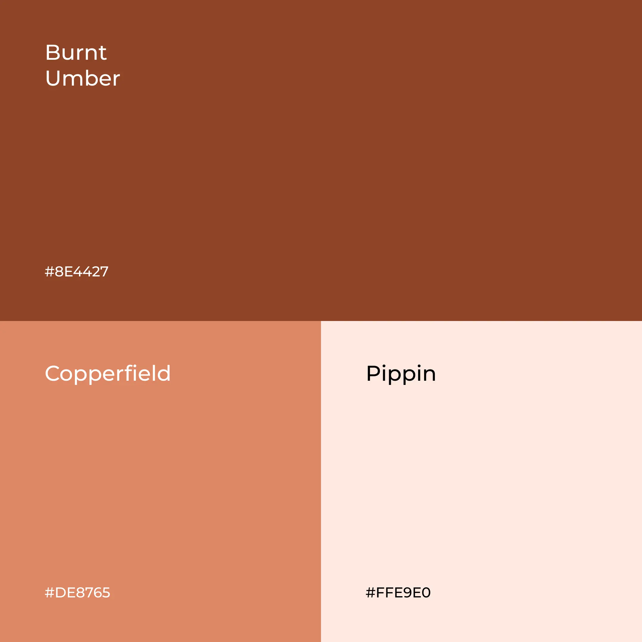
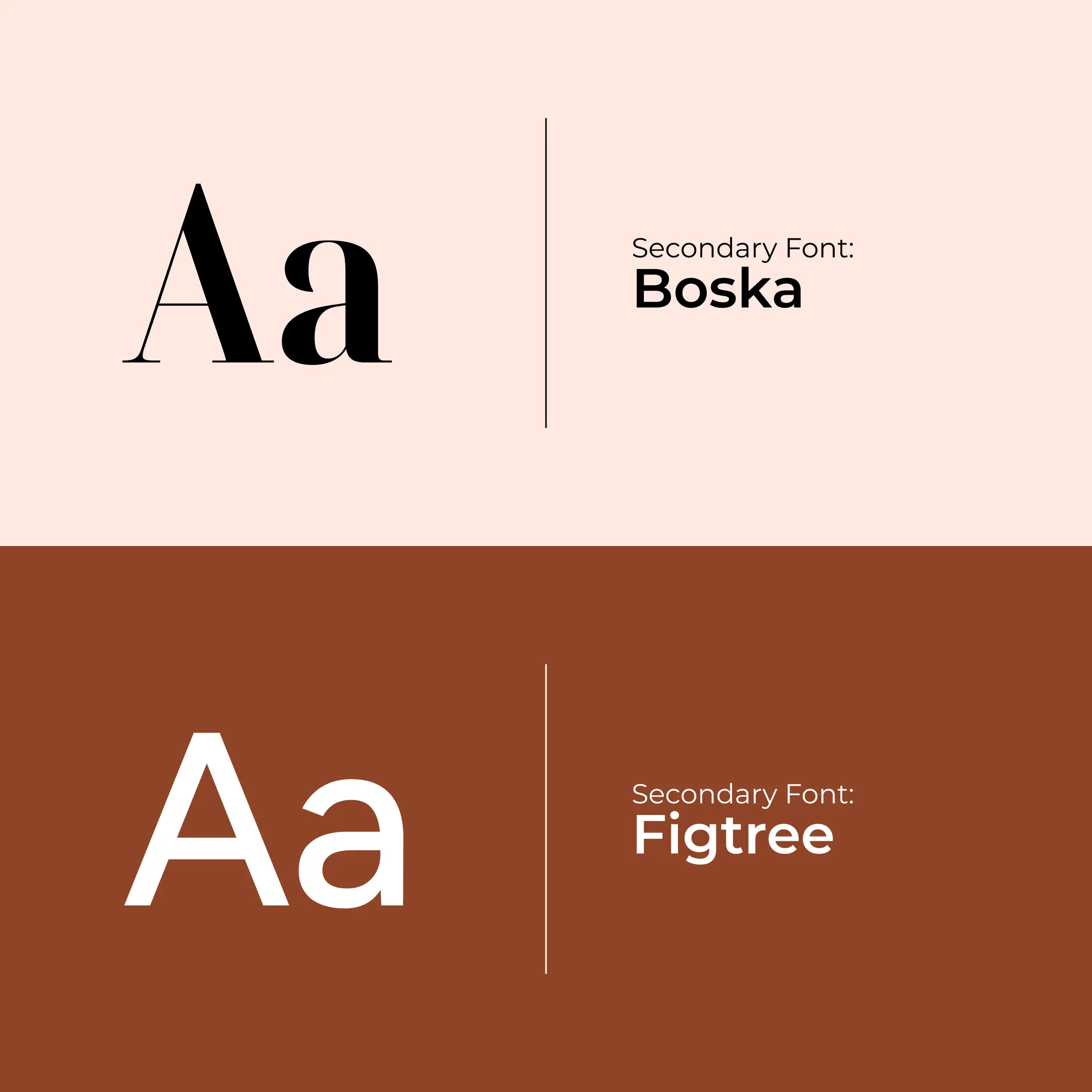
The Tavo logo is a curated story of a life lived with intention. At the founder’s request, we moved away from generic symbols to create a custom-sketched identity that blends her personal experiences, incorporating elements like the staircase of growth, the ritualistic candle, and the human figure of presence. We balanced this "intentional messiness" with clean, architectural lines to ensure it felt sophisticated, not cluttered. Using a soulful, pastel-leaning palette of rich clay and cocoa, we built a visual DNA that feels neutral yet vibrant, positioning Tavo as a premium authority in the art of mindful living.
Packaging Design
Intentional Unboxing:
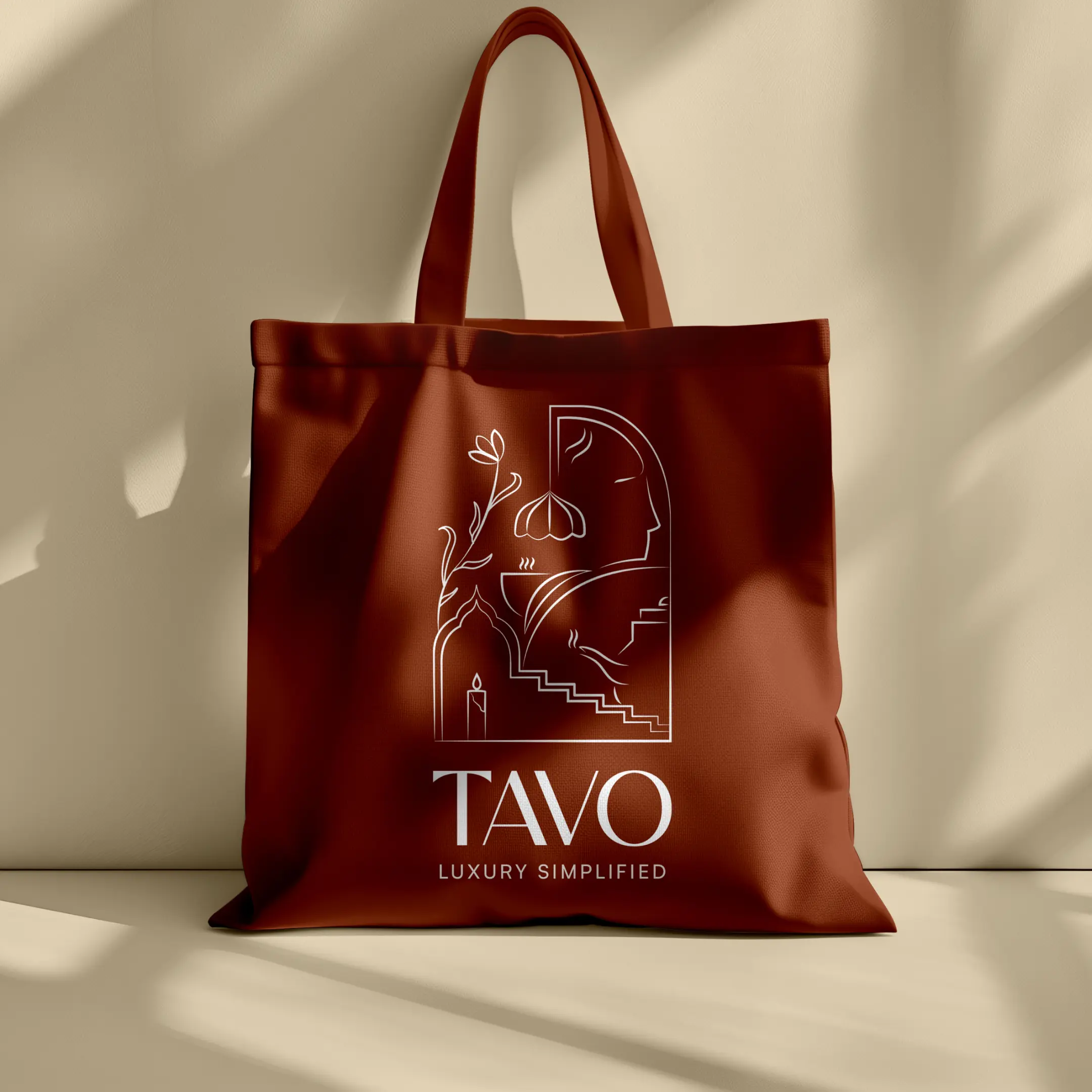
To meet the standards of high-end boutique hotels, Tavo’s packaging had to be more than just a container; it had to be a piece of decor. We redesigned the packaging to move away from retail-heavy aesthetics and toward a "luxury simplified" look.
Packaging Design
Intentional Unboxing:
Every box and tin acts as a tactile invitation to a ritual, using refined sketches and earthy, warm tones that feel expensive yet approachable. It’s a design shift that transforms a simple cup of tea into a serene, sensory moment, ensuring the brand commands its place in the most premium hospitality environments.